Conditional display is used to change which visuals, images, illustrations and so on are included in your publication based on your slicer selections at build time. The "visuals" are placed in a Tab in a Mini-Tabs layout container and the Jump to Tab action is used to select which Tab (and therefore which visual) should be shown in your publication when it is built.
For example, if your company uses different logos in different regions, you can show the correct logo in each document by creating a Mini-Tabs container with tabs that each contain one of the logos and then using a Region or Country slicer to select the correct tab (and, thereby, show the correct logo) at build time.
Note: When Mini-Tabs are used in Publish, the tabs themselves are hidden from the reader (since there is no user interaction). But when the publication is exported or built on a schedule, the visual corresponding to the given slicer selection is rendered in the container tab - effectively delivering conditional display of content in the same real estate.
- Click here to learn how to create Mini-Tabs
Note: This feature is not available in the Community Edition.
Configuring a Jump to Tab Action
Before you begin
To create an Action that changes which tab is shown in a mini-tab container, your publication needs to already include a Slicer and a Mini-Tabs container.
Create the Interaction
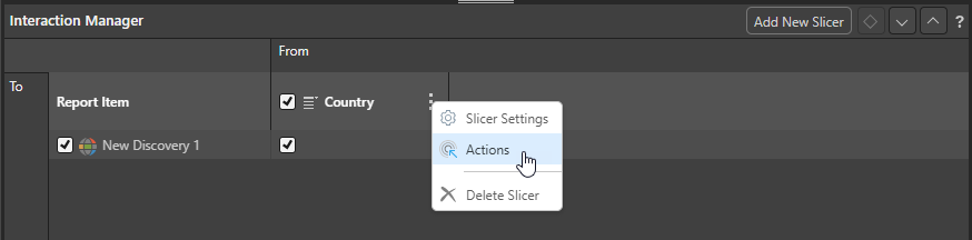
- Open the Interaction Manager and select Actions on the context menu of the Slicer you want to use:
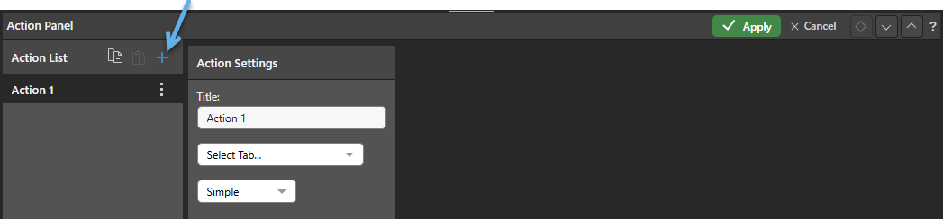
- Click Plus to add an action to the Action List (blue arrow below):
- Optionally, edit the Title for the Action.
- From the Select Tab... dropdown list, choose the Mini-Tab container that you want the action to affect.
- Use the Action Type dropdown list to specify how you would like to define your action:
- Select Simple to use fields to specify which slicer selections should cause which tabs to be selected. For more information, see Simple.
- Select Advanced to write a PQL expression that describes which tab to jump to. For more information, see Advanced.
- Configure your Action and then click Apply to save it.
The Action panel opens for the selected slicer. (If there is no Slicer available, you could create one from the Add New Slicer option.)
Note: In the example above, the slicer also has an interaction with the Map "New Discovery 1." This means that, when you build your publication, the selection from this slicer will affect both the Map and the Mini-Tab selection.
Selecting this option causes the other fields to be shown.
Once your changes are saved, you should build your publication (F2) and check that your selections have the desired effect on your Mini-Tabs container.
Action Panel
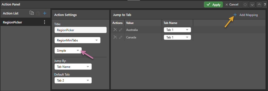
Note: The screens in this section show how you would create a Jump to Tab action that shows Tab 1 where Australia or Canada is selected from the Country slicer at build time, or Tab 2 otherwise. The first example (Simple) uses the simple interface to map the options using fields, while the second example (Advanced) shows how you would achieve the same outcome using PQL.
Simple Action
To jump to specific tabs in your Mini-Tab container when specific values are selected from the slicer, you should select Simple (purple arrow below) and:
- Select a Default Tab that should be displayed when no mapping is defined. This is Tab 2 in our example.
- Create mappings between each slicer value and the tab it should display by clicking Add Mapping (orange arrow below) and selecting a Tab and Value. In our example, you need to create two Mappings: Australia to Tab 1 and Canada to Tab 1.
Jump By
- Choose Tab Name to map the selected value in your slicer to a Tab by its name.
- Choose Tab Number to map the selected value in your slicer to a Tab by its number. Note: Selecting this option means that the targeted tab could change as tabs are added or removed from the Mini-Tabs container.
Default Tab
- The tab that should be displayed when the selected slice does not have its own mapping. For example, the Country slicer includes France and Germany as well as Australia and Canada, when either of these other options are selected Tab 2 (the default) is shown in the built publication.
Mappings
Each Mapping row in the table maps a Value from the selected slicer to a Tab using its name or number. When the publication is rendered, the Mini-Tab container will show the selected tab:
- Click Add Mapping (orange arrow above) to add a mapping row to the table. Once added, select a value from the slicer and map it to a Tab using its name or number (jump by).
Advanced Action
If you want to create a PQL expression that maps the values from your slicers to your tabs, you can select the Advanced option (purple arrow below). You should use this advanced feature if you want to use the PQL functions to create a switching or conditional effect, or otherwise apply additional logic to your action.
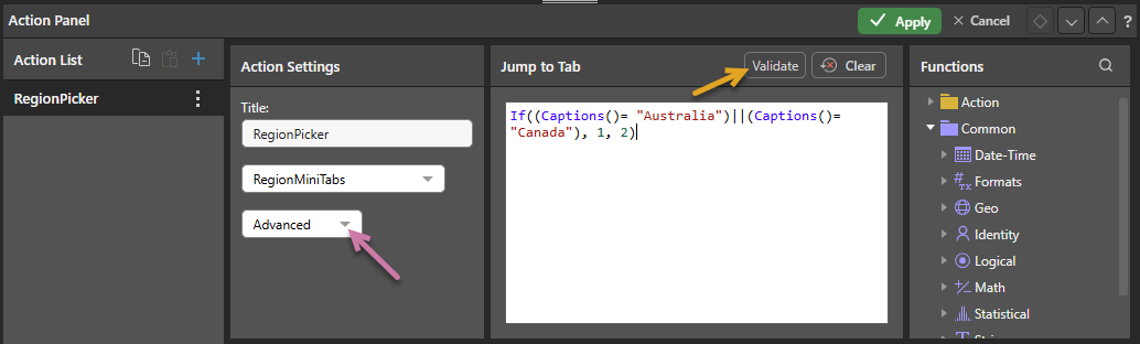
The simple function is: If((Captions()= "Australia")||(Captions()= "Canada"), 1, 2)
Jump to Tab
Type or copy your PQL expression into the text editor to create your expression.
Tip: You can see a description of each available function, including syntax, by hovering your cursor over the item in the Functions tree. You can also double-click the functions in the tree to copy them into the Jump to Tab window.
Once you are finished, click Validate to validate your expression. Click Apply and then save your changes.
Further Advanced Examples
Switch
In this example, the Captions function is inserted into a Switch statement. When United States or Canada is selected from the slicer, Tab 2 is displayed, when United Kingdom is selected, Tab 3 is displayed, and when any other item is selected from the slicer, the default tab (Tab 1) is displayed: Switch(Captions(), "United States", 2, "Canada", 2, "United Kingdom", 3, 1)
If
Like the main example, the Captions function is placed inside an If statement. When United Kingdom is selected from the slicer, Tab 3 is displayed. When any other slicer element is selected, the default tab (Tab 1) is displayed: If(Captions()= "United Kingdom", 3, 1)
Action List in the Action Panel
The Action List shows all of the actions associated with this publication.
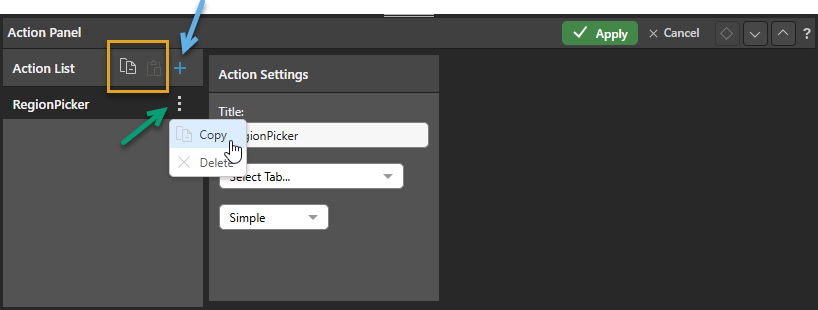
You can:
- Add actions to the Action List using the Plus icon (blue arrow above). Once clicked, you need to create the details of your new Action as described below.
- Delete an action from the list by opening its context menu and clicking Delete (purple arrow).
- Edit an existing action by selecting the name of the action in the list and updating its details in the panel.
Copy Actions between Items
You can also replicate the same action or actions across multiple discoveries and publications using the copy and paste functions (yellow highlight above). Copy one or all actions to your clipboard, then paste the actions to the Action List of your target discovery or publication.
Related information
Printing and Testing
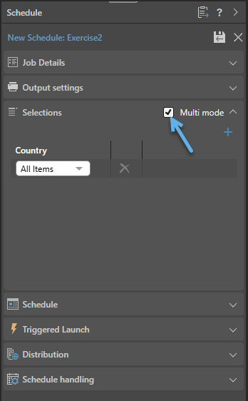
It is important to validate that the Mini-Tab switching is having the effect you expect in the output publication. You might, therefore, want to run a scheduled build that selects all possible values from your slicer and produces a document for each that you can check. For example, you might want to schedule a build of your publication where the selection option is set to select Every Item in the Country slicer:
- Click here for more information about scheduling builds